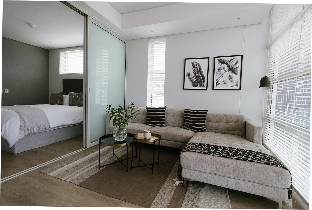
I have repainted four small living rooms in six years, two of them rentals I could not permanently alter, and my verdict on color schemes for small living rooms is blunt: stay inside one undertone family, use no more than three tones, and keep the room’s longest walls within roughly three LRV points of each other. High contrast pulls the eye to edges, and edges are what tell your brain a room is small. That principle sits inside my small living room look bigger guide, and everything below is the color-specific depth behind it.
Table of Content
How Light Color Schemes Expand Small Rooms
What Light Reflectance Values Actually Tell You
Every tin of paint carries a Light Reflectance Value between 0 and 100, and that figure is the most honest data you get before buying. Chantilly Lace sits around 90.6, Revere Pewter lands near 55, and Hale Navy drops to 6.3. In a 12-by-14-foot room I measured with a borrowed light meter, moving from a 55-LRV greige to an 82-LRV off-white visibly pushed the back wall further away.
A high LRV is not automatically better. The spread between your lightest and darkest surfaces is what registers. A 90-LRV wall beside a 10-LRV accent creates a hard visual border, while an 85-versus-70 pairing reads as a soft gradient. Most small rooms I have worked on look roomier with a wall-to-wall spread under 25 points, reserving deep tones for textiles, frames, or the fireplace.
Which Surfaces Should Stay Lightest?
The ceiling is the one surface nobody watches and everybody senses. Keeping it two to five LRV points lighter than the walls prevents that lid-coming-down feeling in rooms under eight feet tall. The wall opposite your main window deserves similar treatment, because it receives the least direct light and will read darker than its label suggests regardless of what you bought.
A darker accent belongs on the wall you see last when walking in, or behind the sofa if that is the natural focal point. Painting the window wall dark silhouettes everything standing in front of it, which is the fastest way to lose visual square footage. My rule is simple: light on the light-receiving plane, deeper on the plane that anchors furniture.
Does the Ceiling Color Matter More Than the Walls?
In low rooms it does more work than any single wall. Color drenching, where walls, trim, and ceiling share one shade, looks intentional and calm under nine-foot ceilings but flattens headroom below eight feet. If you love a saturated olive or navy, try it on the ceiling of a tall room and keep the walls light; the ceiling lifts instead of pressing down.
| LRV Range | Typical Colors | How It Reads | Best Use in a Small Room |
|---|---|---|---|
| 80 to 95 | Chantilly Lace (90.6), Alabaster (82) | Bounces most light, walls recede | Ceilings, window walls, north-facing rooms |
| 70 to 79 | Soft off-whites, warm whites | Open but not sterile | Main walls in rooms under 150 square feet |
| 55 to 69 | Revere Pewter (55.5), Edgecomb Gray (63.2) | Comfortable mid-tone, holds up in daylight | Long walls in rooms with decent light |
| 30 to 54 | Muted sage, clay, dusty blue | Visually advances, feels enclosing | Accent walls, alcoves, tall ceilings |
| Under 30 | Hale Navy (6.3), charcoal, deep green | Absorbs light, reads dramatic | One focal wall or furniture only |
Which Color Scheme Suits Your Small Living Room?
One-Tone Schemes for Low Ceilings
If your ceiling is under eight feet, a single light tone across walls and trim is my default recommendation. With no visible color break at the wall-trim junction, the eye has nothing to measure and the room reads taller than its tape measure suggests. I keep trim within one or two LRV points of the walls instead of the traditional white-on-color contrast.
One-tone only works when the undertone is genuinely consistent. A warm wall paired with a cool white trim reintroduces the exact horizontal line you were trying to erase, just more quietly. Bring every sample into the room, lay them edge to edge, and check them at 8 p.m. under your actual lamps before committing to gallons.
Two-Tone and Color-Drenched Approaches
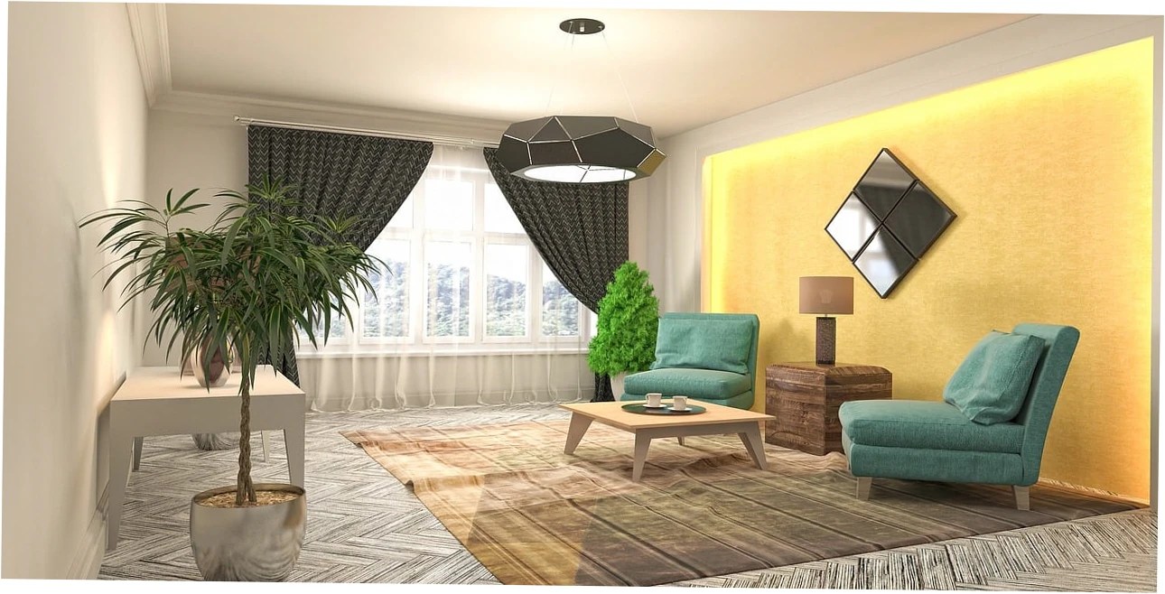
Two-tone schemes give structure without shrinking the space, provided the darker half lands on a vertical plane rather than a horizontal one. A soft clay on the two short walls with a warm white on the long walls adds depth while keeping the longest sight lines bright. Reverse that arrangement and the room narrows instead.
Color drenching is the scheme I recommend most for tall, awkward rooms rather than small ones. It reads deliberately modern and hides architectural clutter, but in a genuinely tight room it can make the box feel like a box. Choose it when the ceiling clears nine feet or when the room has generous daylight.
Where Rugs and Floors Fit the Palette
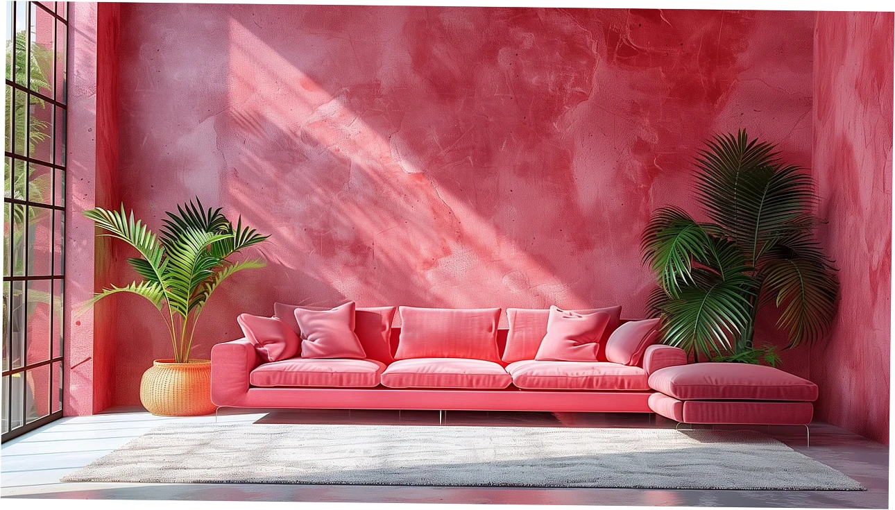
Floor tone is part of your color scheme whether you planned it or not. A pale oak floor with pale walls can turn a room into a washed-out beige field, so I usually introduce a mid-tone rug as the anchor. Getting the rug size for small living rooms right also matters, because an undersized rug makes the surrounding floor read as a border and shrinks the seating zone.

Common Color Scheme Mistakes in Small Living Rooms
Too Many Undertones in One Sightline
Warm grey, cool grey, and true beige can each look perfect alone and muddy together. When three undertones share one view, the eye reads indecision rather than depth and the room feels busy instead of open. My fix is to pick one undertone and express it in three values: light, mid, and deep.
Lighting temperature is usually the real culprit. Bulbs at 2700K add yellow, 4000K adds blue, and the same wall can read greenish under one and pink under another. Settle the bulbs first, then buy paint. The reverse order explains most of the disappointing grey walls I have been asked to diagnose.

Choosing Sheen Without Thinking About Bumps
Higher sheen reflects more light, which is why eggshell and satin dominate small rooms. The trade-off is that glossier finishes exaggerate drywall imperfections under direct light. Flat hides flaws but scuffs fast in a family room. My compromise is matte or eggshell on walls, satin on trim, and washable finishes only where hands actually touch.
Forgetting the Trim and Door Contrast
Crisp white trim against colored walls is a beautiful look in large rooms and a set of extra edges in small ones. If your room is tight, bring trim closer to the wall color rather than further from it. It is a subtle change that photographs poorly and lives beautifully, and it costs nothing extra.
| Mistake | Why It Hurts | The Fix |
|---|---|---|
| Three or more undertones in one view | The eye finds no resting point | One undertone family, three values |
| Bright white trim on mid-tone walls | Adds horizontal edges that break the wall plane | Trim within two LRV points of the walls |
| Cool grey in a north-facing room | Blue cast makes the room feel cold and closed | Shift to warm white or greige |
| High-gloss walls in an older home | Reflects light but exposes every drywall flaw | Matte or eggshell walls, satin trim |
| Dark paint on the window wall | Silhouettes furniture and blocks perceived depth | Move the deep tone to the last wall you see |
Warm vs Cool Neutrals in Small Rooms
North-Facing Rooms and Grey Undertones
North light is cool and indirect, so it amplifies blue and grey undertones in whatever you put on the wall. Warm whites and greiges with a yellow or red base neutralize that chill. Pure cool grey in a north-facing room can tip toward silver-blue and feel cold in winter, which remains the most common complaint I hear about grey paint.
South-Facing Rooms and Warm Whites
South light is bright and warm, and it can make yellow-based whites look almost orange by mid-afternoon. In those rooms I lean toward cleaner whites with a hint of grey or green. East and west rooms shift through the day, so a balanced mid-tone greige is usually the safer bet than a strong white either way.
Renters, Pet Owners, and Busy Households
If you cannot paint, your color scheme lives in textiles: a large rug, curtains, slipcovers, and art. Renters can still control undertone consistency, which is most of the visual work. With pets or toddlers, choose mid-tone washable finishes over pale flats, and keep the darkest tone on furniture rather than walls, since scuffs show far less on mid-tone paint than on light trim.
| Natural Light | Recommended Undertone | Direction to Explore | Watch Out For |
|---|---|---|---|
| North-facing, cool and even | Warm white or greige with yellow base | Alabaster, warm ivory | Cool grey turning silver-blue |
| South-facing, bright and warm | Clean white with slight grey or green | Soft white, pale grey-green | Yellow-based whites going orange |
| East-facing, strong morning sun | Balanced mid-tone greige | Edgecomb Gray family | Cool tones looking flat after noon |
| West-facing, hot afternoon light | Slightly cool neutral | Warm grey, taupe | Warm tones glowing too strong at dusk |
| Little or no natural light | Mid-to-light warm neutral with eggshell sheen | Warm white, soft clay | Very pale colors going grey |
Testing and Sticking With Your Color Scheme
Sample Pots and Two-Coat Patches
Paint two coats onto a foot-square piece of primed drywall or heavy card, not a single coat straight onto the existing wall. Your current color shifts the sample, and one coat never shows true depth. Tape patches at eye level on at least two walls and watch them at 8 a.m., noon, and 9 p.m. before buying a gallon.
Budgeting Paint, Primer, and Touch-Ups
For a room around 12 by 14 feet, plan on three to four gallons for two wall coats, plus primer if you are covering a dark color. Low-VOC and zero-VOC lines cost a bit more and matter in small rooms with limited airflow. I keep a labeled quart of each color for touch-ups, because matching a faded wall later is nearly impossible.
Adjusting the Palette Without Repainting
Before you repaint, try changing the light. Swapping 4000K bulbs for 2700K, adding a warm floor lamp, and pulling the rug tone closer to the wall tone can shift a room more than new paint would. If that is not enough, change one value at a time so you can actually tell what worked.
Questions About Small Living Room Color Schemes
Do light colors always make a small living room look bigger?
No. Light colors expand a space only when they stay within a narrow value range across walls, ceiling, and trim. A bright white wall against a dark floor and dark trim still creates hard edges. In several rooms I tested, a consistent mid-tone greige read larger than stark white interrupted by strong contrast.
Is an all-white color scheme the best choice for a tiny living room?
All-white is a strong default but not a universal winner. It demands consistent undertone, otherwise the whites fight each other, and it shows every scuff. A white family paired with one mid-tone, such as a wood floor, linen sofa, or wool rug, usually looks more intentional and stays cleaner than pure white on every surface.
What is the biggest risk of painting a small living room dark?
The real risk is not size, it is light loss and reversal cost. Shades under 30 LRV absorb most available daylight, so a north-facing room can feel dim by late afternoon, and going back to light requires primer plus two finish coats. Reserve dark tones for one well-lit wall or a tall ceiling.
How many colors should a small living room color scheme include?
Three values of one undertone is the sweet spot: a light for ceilings and long walls, a mid for secondary walls or upholstery, and a deep for accents. Add a fourth only if it repeats something already in the room, like a wood tone or a plant. More than that usually reads as clutter.
How much does repainting a small living room cost?
For a room around 150 to 180 square feet, expect three to four gallons of wall paint, one gallon of primer, and trim paint. Prices swing widely by region and brand, and low-VOC lines sit higher. Doing prep and rolling myself removed the labor line entirely, which is normally the largest part of any quote.
Which color schemes work for renters who cannot paint?
Build the palette in textiles: a large rug covering most of the seating area, curtains hung close to the ceiling, and slipcovers in one undertone family. Keep temporary wallpaper to a single focal wall. Undertone consistency does most of the visual work, and you can take all of it with you when you move.
Can I use the same color on the walls, trim, and ceiling?
Yes, and above nine-foot ceilings it is one of the most elegant options available. Below eight feet, a fully drenched room can feel compressed unless the color is light. Try a tint about 15 to 20 percent lighter than the wall color on the ceiling; it keeps continuity without lowering the lid.